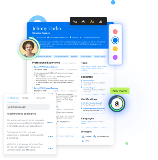
Looking for the latest resume design templates?
[Click here to directly go to the latest resume design sample]
Design can be art. Design can be simple.
Paul Rand's word stands out because of its depth in simplicity. Pretty much how recruiters envision cool resumes to be.
Designing can be easy but it might just get tough as the balance between simplicity and designing has to be maintained.
Poor design can ruin an otherwise good product.
Similarly, poor resume design templates can ruin an otherwise cool resume.
In the modern world, the presentation can make you or break you. The same is the case for a resume.
Presentation matters in the case of a resume as well.
The job industry demands a good presentation of your career journey.
As we say, in 6-seconds a recruiter has to be impressed with attractive yet meaningful design to take a positive decision.
In the often-lamented tale of the recruiter-skewed world, you do not have many options: either learn to be a designer or forget it.
But here is the good news. You don't have to become a resume designer to make a creative resume design.
This blog will walk you through:
- The Creative Resume Designs Templates for 2022
- How to design a resume?
- Highlighting Headers in a Resume Design
- Colourful Resume Design Template
- Minimalist Black & White Contrast Resume Design
- 1-pager and 2-pager resume
- Single coloumn and Double-coloumn resumes
In this article, we will explore our best selling templates and show you a way through it.
Creative Resume Designs Templates 2022
All the designs shown here are the recruiter's favorites.
5 reasons why these simple resume design templates examples should be used for your resume today:
- These simple resume design templates are catchy and attractive.
- These simple resume design templates are sober yet stylish.
- These simple resume design templates increase your chances to land interviews.
- These simple resume design templates are compiled from our collection and collection from the web.
- These simple resume design templates present your content in the best possible manner.
How to design a resume?
Good resume designs allow your resume to stand out almost 3x more than a simple resume.
For more creative resume design ideas, you may check out Hiration's free online reference toolkit.
Hiration's resume tool offers the option to change resume designs with a single click.
However, if you are looking for using other cool resume design ideas, you should always ready the content first.
Once the comprehensive set of sections are ready, you may easily use an editor to change the colors.
You may also opt for 30+ cool resume designs that our online resume builder offers.
Boxes in a Resume Design Template by Hiration
On the face of it, cool resume designs have little to do with boxes.
But, it is brilliant to observe how it changes the look and feel of an otherwise dull resume.
Boxes lend symmetry and clarity to the simple resume design template.
So, here's how to design a resume box design template.
New York Resume Design
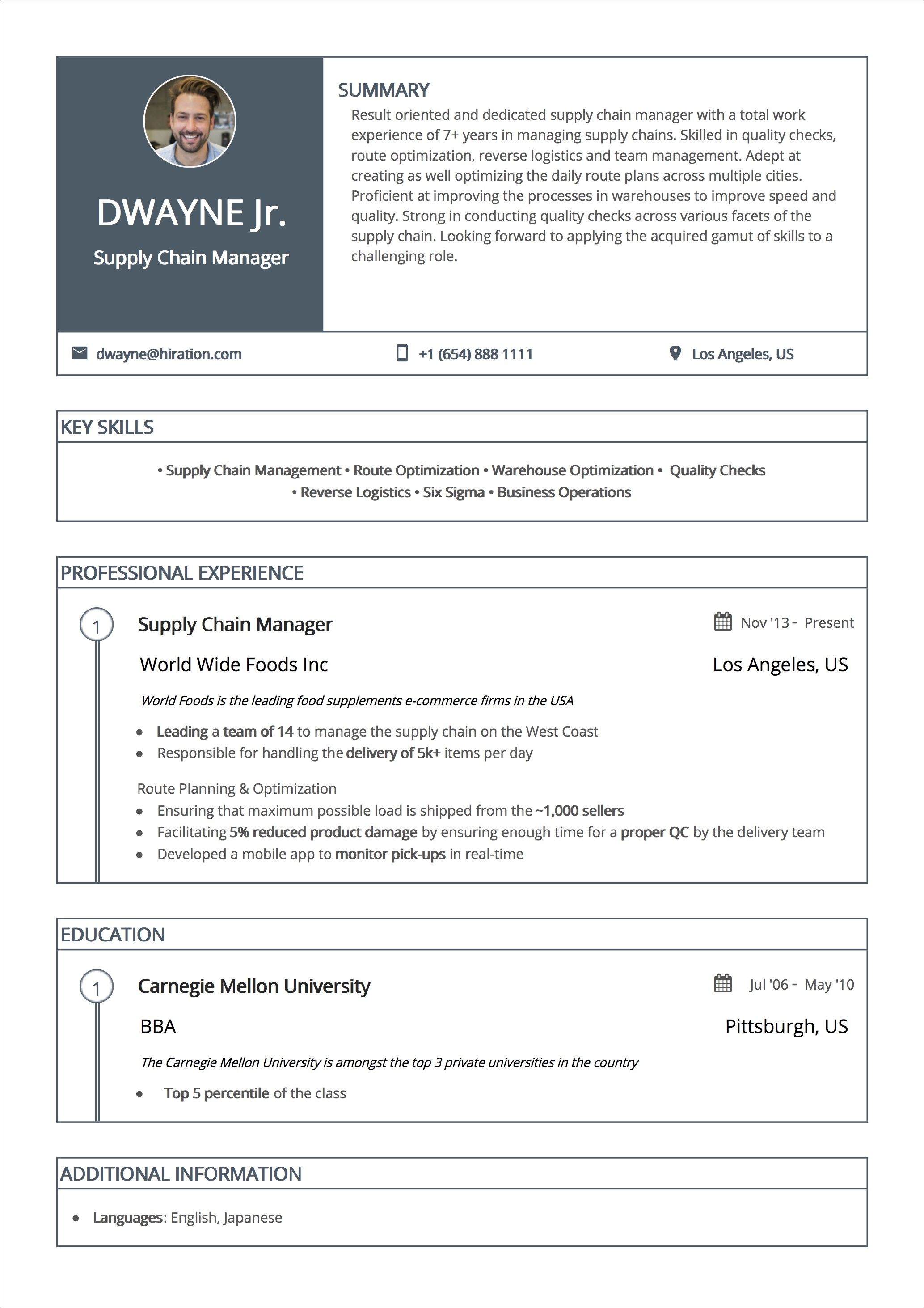
This cool resume design uses boxes more soberly with new york blue color used to highlight the personal picture and candidate's name. Here's how to design a resume box with new york resume design.
This design emblazons the top header box with your current designation making it stand out among other resumes.
Headers and text are kept in the white background making use of ample white space.
This design goes in 2-pages and incorporates a lot of information and content.
DOWNLOAD OUR FREE RESUME DESIGN TEMPLATE TO QUICKLY KNOW HOW TO DESIGN A RESUME.
Bright Highlighted Headers in a Resume Design
Orange Twist Resume Design
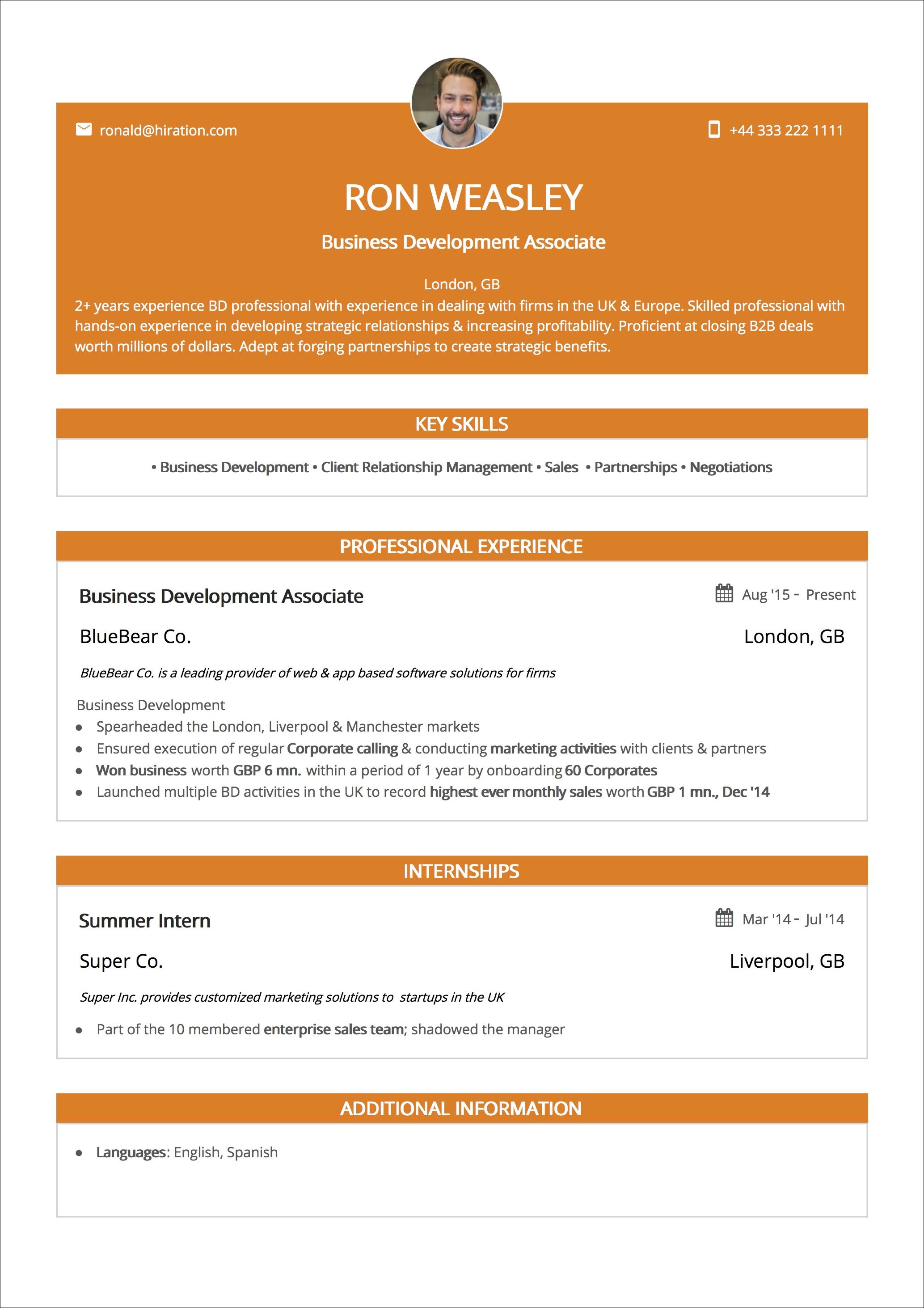
This is yet another design that tells the tale of the bright highlighted header in a resume.
This orange beauty fits the bill and is a perfect example of brightness blended with elegance.
Orange headings render a symmetrical and clear look to the cool resume design.
This special resume design highlights your career summary apart from protruding pictures and personal details.
For a 6-seconds resume scan what else can be a treat than quickly scanning through the highlighted career summary.
Try this cool resume design here
For a brilliant career summary and landing your dream interview, read our Guide on Career Summary.
Space Clever 1-pager Resume with double-coloumn Design Template
Global Citizen Red Resume Design

This is one of our good resume design templates.
With the colorful header, it definitely shall give a happy heady feeling to your dream company's recruiter.
Care for how the content would be incorporated?
Do not worry as the stellar design takes care of this.
It uses 2-pages and double columns to incorporate your career information.
There is ample white space that renders clarity and professional feel to this resume design.
Let us compare it with this cool resume design:-

Comparing our previous design with this wishy-washy resume design, it is evident how a change in design can increase your resume shortlisting by many folds.
Try this good resume design here
Besides, did you just secretly wish that resumes were sold in a shop? Do not worry and just use our Resume Builder to build a resume in as much time as your loved one prepares the dinner for you!
Gradient Green Resume Design

This cool resume design lends oodles of brightness and color to your resume with the usage of die-cut section designing.
It inherits boxes from our previous section and combines the double-column design in the same.
Boxes give a neat look and separate the information from other sections making it readable and understandable.
The popping green headers make for clear and good resume design irresistible for the recruiter to ignore.
A gilded section for the personal picture adds to the increased probability of shortlisting.
Needless to say, the usage of a double column saves space and makes it easy for the recruiter to read many sections at one go.
Typography is kept to the open sans font at the size of 12.
Try this resume design here.
Elegant & Vintage Resume Design Template
These are good resume designs that denote a vintage vibe with a touch of newness and elegance.
Traditional Blue Resume Design

Embracing one of our favorite designs, it comes very handy when you have to incorporate information of more than 15 years of the career journey.
For our senior clients, this good resume design is a life-saver.
The white space is used very wisely to give a neat look to the otherwise content-heavy resume.
The color palette is kept soft and the blue shade renders a lot of elegance to the resume design making it appear nothing but professionally fantastic.
Try this design here.
Timeline in a Resume Design Template
This good resume design cleverly captures your career journey in a stylish timeline format.
Signature Resume Design
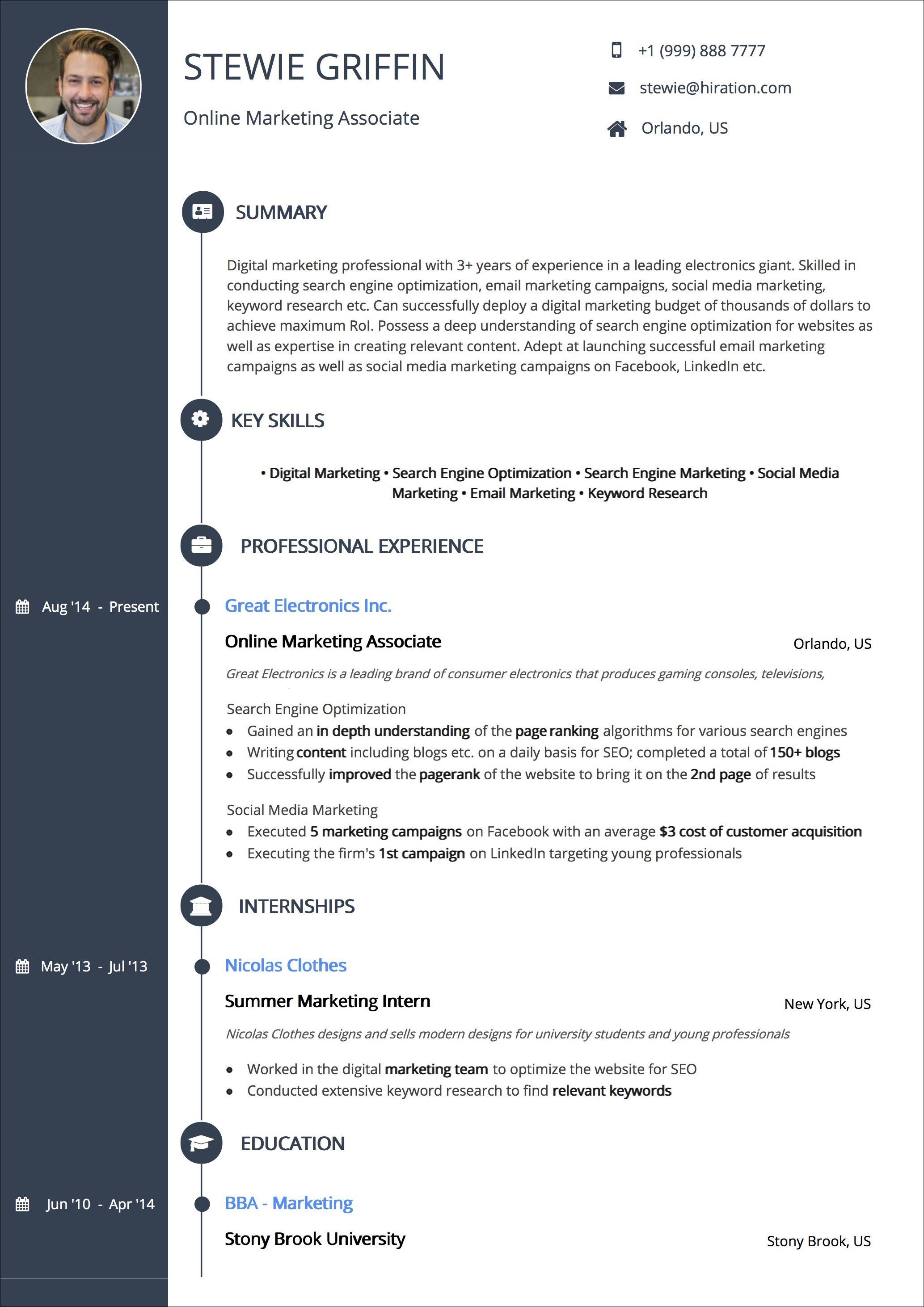
This good resume design has a novelty of showcasing the information in the form of a timeline.
Additionally, it comes with a USP of adding your initials to the resume design.
This good resume design renders a consistent look and uses icons for all headings nodding to the designer's love for experimentation.
These good resume designs truly decode the flavor of a timeline feel and make it look creative.
Try this design here.
Colourful Resume Design Template
Trendy Resume Design

Striking multiple balance, this template is a designer's glory and a candidate's dream come true.
With its' quirky illustration, employing different colors for the icons and 2-column architecture, this good resume design combines the best of different resume design templates mentioned before.
The use of bright, pink, and orange accents renders a colorful yet simple look to the resume due to the consistent use of white space and black text.
With ample white spacing and no header colors, the resume feels rooted in its old-world charm yet very useful for landing dream interviews.
Try this design here.
Coloumn Popper Resume Design Template
Professional Black Resume Design

We are pretty drawn to this good resume design highlighting the details in 1 column in a bright popping color.
Referring to the image, this candidate has highlighted his extra-curricular achievements and selected projects in the popped up column.
Needless to say, these details can always be replaced by sections like 'Certifications' and 'Awards & Achievements'.
This good resume design showcases a crisp and refreshing approach and is certainly a timeless classic.
Try this design here.
Classic Resume Design Templates found on Web
Graphical Resume Design

This rather bold illustration of resume content on a pale color palette renders this good resume design an old press charm.
Good resume design comes across as unique with all credentials mentioned in some form of graphics.
As the next century resumes are going to be graphically inclined, it might be a great idea to get a hang of it.
You can find this good resume designed by Fay ZodiacFay here.
Creativity at its' Best Resume Design

A template by Freebies, focuses on highlighting specific aspects of your resume like Education and Experience.
A print-ready resume template is highly creative in the use of section structure and background graphics.
Go Groovy with this Modern Resume Design

As if this good resume design says - No looking back after this!
This is one good resume design that woulda sweep the floor underneath you with its groovy sections and mind-blowing graphics.
The colors used are par excellence and the clever usage of icons and charts is heart capturing.
The creative response highlights the infinite possibilities in good resume design.
This typographic resume design by Paolo Pettigiani would be perfect for someone who can get away with information displayed in small phrases as there is not much scope of too much information.
You can get this good resume design template on this link.
Minimalist Black & White Contrast Resume Design
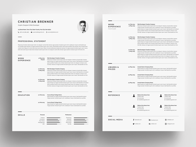
Minimalist is a new word for peace and poise.
The same holds true for good resume designs.
A mute piece of paper though, this resume design does talk a lot about your poise and grace.
The resume is the first-hand expression of your personality. And this minimalist resume design gives a lot of positive impression about you.
This is the best bet when everything else fails and when everything else is there to confuse you.
This is easy, soft on the eyes, and quick to read through.
Never forget, simplicity remains the best policy!
The link to this good resume design can be found here.
White is in! Resume Design Template
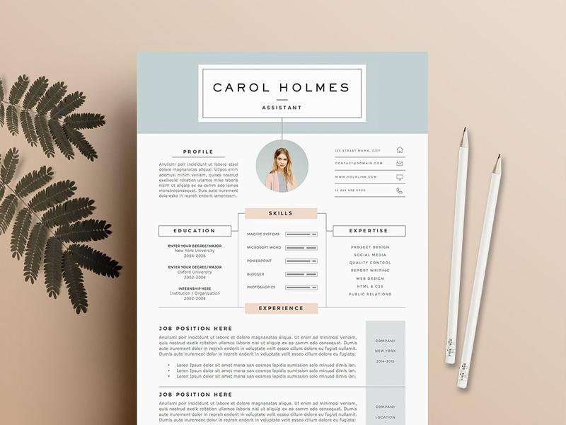
This is a good resume design with ample white space combined with soft pink and blue accents to give a light feel to the resume.
Letters are kept modern and sharp and black font color is used throughout.
You can find this good resume design template link here.
Picturesque Resume Design Template

The first thought which comes to our mind looking at this good resume design is...?
Facebook?
Someone's timeline?
Quite similar to modern-day social media sites, this good resume design is what is required in the modern resume world with a picturesque cover picture displayed.
It again gives a very unique look distinguishing it from conventional resume design templates often used.
It is a sure hit in the employment industry and should be experimented with.
You can find this good resume design template link here
Pro tips to keep in mind while crafting your resume design
Spacing & Margins
Resume margins serve 2 important purposes in your resume:
- Enhances the visual appeal by giving more white space and symmetry to the resume design.
- Gives space to the recruiter to write short notes about you.
As a rule, you can set your margins at 1 point on all sides.
This gives ample space to the resume and your resume design does not appear jumbled.
Colour Palette
Contrasting colors enhance the readability of a text on the web or print.
More colors do not mean colorful.
Whatever formatting you do reflects your personality and mindset.
So, a neon-green color used in a resume design is surely a call for rejection.
There are high chances that the color you use is heavily disliked by the recruiter and thus your application is rejected with the first glimpse.
Also, the use of colors depends on the industry you are applying to.
If you are in industries like banking, finance, analysis, then it makes sense to use soft colors like blue hues to highlight headings throughout the resume.
Bright and bold colors can be used in graphic designing.
However, the safest bet is to use a soft color palette and enhance the creativity of the resume design yet giving it a professional look.
Font Type and Colours
Your resume font forms a very important part of your resume design template formatting.
A wrong font could ruin the entire look of your good resume design.
After a lot of research, we have come to some pro-tips to help you get through:-
-
Go bold to highlight important information like quantities, numbers, achievements, sub-heading in the work experience section.
-
Font size: 16 pts. for heading, 14 pts. for sub-headings and 12 pts.for text
This size structure looks at a professionally made resume. -
Which font: Sans Serif turns out to be the best bet as far as a good resume design is concerned.
Serifs are the small lines tailing from the edges of the fonts. It looks good in a printed text.
Open sans which is a sans serif typeface is minimalistic and modern font.
The reason for preferring open sans in a resume design is that the web has a resolution of 100 dots per inch whereas prints have a resolution of 1000 dots per inch.
You can also prefer to use sans serif for small text and serif for normal text.
Hiration Pro Tip: Choose a font which diverts the reader's focus on the message conveyed and not on the font used.
A good resume design should never use more than 4 font sizes and 3 font style.
For more elaborate information, visit our Guide on Fonts
1-pager or 2-pager?
It all depends.
Yes. That is right.
It depends on how much experience you have and what the employer has asked you to present.
So let us boil it down to a few standard rules:
- Use a 1-pager resume if:
a. You are a fresher and looking for an entry level job.
b. You have been specifically asked by the employer to present a 1-pager resume.
c. You have less than 10 years of work experience with not more than 2 jobs changed.
- Use a 2-pager resume if:
a. You have more than 10 years of work experience and have changed more than 2 jobs.
b. The employer has not given a restriction on the number of pages.
For more details, please visit our Guide on 1-page Resume
Single coloumn or Double-coloumn
There is again no set rule. It is an individual's preference and both the resume design formats go in the industry.
Double- column resume design template appears to be more appealing, gives concise information on the very first page without the recruiter having to flip pages.
If the content is light in the work experience section, a double-column template can be specifically used to give a content-rich yet organized look to the resume.
At the same time, a 1-column resume design template gives a sophisticated and sober look and can be used if you have heavy content to present.
Key Takeaways
- While choosing the best resume designs for you, take note of your industry and decide what would work the best.
- Use bold colors only if you are very sure that it does not ruin the professional feel of the resume.
- The rule of thumb is to go light on the color palette for a good resume design template and do not use more than 3 colors. 2 colors are known to be the best.
- Use creative resume designs when you are in a creative arts industry like graphic designing, interior designing, etc. but use sober ones if you are in a non-arts industry like banking, research, science, etc.
- While printing your resume, use a professional quality printer and paper. You can use a bond paper. You can use a patterned paper as well but it does not copy that well in a photostat machine.
Do you have any other creative resume designs which you would like to share?
Go to Hiration career platform which has 24/7 chat support and get professional assistance with all your job & career-related queries. You can also write to us at support@hiration.com and we will make sure to reach out to you as soon as possible.
